|
| Home
> Courses & séminars > Agrégation>
2001 : image analysis |
| |
| Agrégation 2001 : image analysis |
|
| Responsable
: Professeur Marie-Madeleine Martinet |
| |
| POSITIVE AND NEGATIVE SHAPES |
| |
Positive shapes are the solid volumes (eg.
buildings and objects), whereas negative shapes are the empty spaces
between them (eg. streets, or patches of sky). Though our conscious
attention focuses on the positive shapes so as to identify objects,
the outlines of the areas between them form negative shapes which
have strong unconscious emotional appeal. This has been recognised
in the psychology of visual perception, for instance recently by
Betty Edwards.
In architecture, Bruno Zevi (an architectural theorist of the mid
twentieth century) says the test of connoisseurs is that they will
not only be able to define the shapes of the buildings, but also
of the streets and squares between them: who is able to tell the
shape of the Piazza di Spagna in Rome? (though everyone could describe
the buildings surrounding it) Answer |
| |
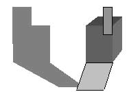
| Positive shapes |
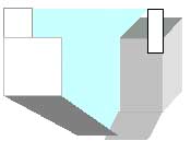
Negative shapes |
 |
 |
| The attention focuses on the
buildings, the pavement and the shadows |
The attention focuses on the
blue vase-like shape of the sky between the buildings |
|
| |
This choice concerns the vertical
representation: |
| |
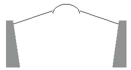
| Convergence of building lines |
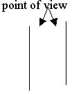
Convergence of street walls |
 |
 |
| if the focus is on buildings,
the principle of vertical convergence will be applied to them |
if it is on the street, the
gaps will be emphasised |
|
| |
| For a corner building: |
| |
| conventional representation
would be: |
But a painter may select: |
 |
 |
| If cityscapes (pictorial
or photographic) are used as documents on the social history
of urban environments, it is important to notice which of the
two projections was used: |
| the artist throws into relief
the buildings as the dominant feature of the view |
the emphasis is on the public
space of the street (which is itself an issue in the social
interpretation of city life) |
|
| |
http://www.tate.org.uk
Paul Nash, Mansions of the Dead (1932)
How are we to interpret the lines diverging towards the top? |
| |
|
Realistic
interpretation: The lines are really converging

|
| Intellectual
interpretation: The lines are parallel, the observer
is placed near the top of the view, which gives a vertical
perspective illusion (high angle view)

|
| Emotional
interpretation: the empty spaces are the dominant
subject (death) and they are drawn correctly; the solid objects,
which play a supporting part only, exist as foils to the void

|
| The eye will naturally
attempt to interpret the divergence of the solid volumes according
to the usual geometry, and failure to identify such a pattern
will cause a feeling of uncertainty which is sought for by the
artist to release the emotions; simultaneously, the emotions
will immediately be attracted to the negative shapes instead.
|
|
| |
| |
| |
| |
| Dernière mise à jour : 27/01/2004 |
|


