| |
 |
keys
for a present-day Gold Bug |
 |
|
| |
| The theory will be found in Villes
en visite virtuelle |
| |
Finding the answers requires raising
the right questions first, and here are five of them:
 Elevation
or perspective? Elevation
or perspective?
 Frontal
or oblique view? Frontal
or oblique view?
 Where
is the vanishing point? Where
is the vanishing point?
 How
are the distances articulated? How
are the distances articulated?
 How
does the composition relate perpendiculars to diagonals? How
does the composition relate perpendiculars to diagonals?
|
| |
| |
| ELEVATION
OR PERSPECTIVE? |
| |
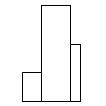
Elevation |
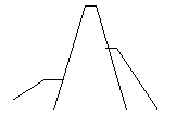
Perspective |
|
|
| Option The
draughtsman may select to draw a building with the lines
of the wall remaining vertical as they are in reality;
such views are made of rectangles. Interpretation
This is the practice in architectural draughtsmanship,
and choosing it will make the drawing look professional
and technical, like an engineering diagram. |
Option
The draughtsman may also select to show the verticals
strongly converging towards the top, as when a passer-by
looks up towards the top of a tall building from its foot ;
the volumes approximate conic shapes.
Interpretation This is the practice in landscape
and townscape painting, and it will make the picture
look like ‘’an artist’s impression.’’ |
|
| |
The choice is obviously important in
cities whose image relies on a skyline of skyscrapers (though
only a small proportion of its buildings are actually skyscrapers).
Historical significance:
Around 1930 (when the major skyscrapers such as the Chrysler
and the Empire State Building were competing for the title
of ‘’tallest building in the world ‘’),
numerous artists selected to give views of them as close as
possible to the elevation, with parallel lines placing these
examples of extreme modernity in the timeless classical tradition
of architectural draughtsmanship.
The perspective presentation on the contrary is more frequent
in recent views.
It is possible in photography either
- to have a result close to the elevation, by reducing the
convergence of lines with a telelens
(a lens of more than 50 mm of focal length)
- or conversely to emphasize the perspective with a wide-angle
lens (less than 50 mm).
When analyzing a photograph, it is necessary to guess the
focal distance of the lens which was probably employed so
as to understand the artist’s intention.
Examples |
| |
Elevation |
Perspective |
| http://www.esbnyc.com |
http://www.realtech.com/webcam |
| The home
page of the Empire State Building website shows the hall
of the building with its 1930s decorative panel in the
centre representing the skyscraper in elevation: this
is period aesthetics (Art Deco). On both sides, the
walls of the hall are in perspective (projected as oblique
lines); so the view of the past in the distance is framed
in a present-day mode of vision. Entering the website
is boarding a visual time-machine. |
This site
shows views of Manhattan from the top of a skyscraper
in different directions and at several times of the day.
Since it emphasizes the multiple appearances a cityscape
takes according to circumstances – and the technology’s
capacity to evoke them – it also marks the transformed
shape of the buildings due to the perspective illusion
caused by the high viewpoint: verticals become oblique
lines converging towards the ground. |
|
| |
| |
| FRONTAL
OR OBLIQUE VIEW? |
| |
Frontal
view |
Oblique
view |
 |
 |
| Option The
draughtsman may choose to present a view of a building
where the façade is parallel to the picture plane.
Interpretation It gives an impression of stability.
It is the practice in architectural drawing or photography,
since it maintains the proportions of the various elements
and thus allows measurements to scale. |
Option Or
the draughtsman may prefer to show the building on the
angle.
Interpretation It suggests that the viewer can
walk around it and see it from different viewpoints.
It evokes a dramatic presentation, the building been
part of a developing story. This is frequent in films. |
|
| |
Historical significance:
Representing New York buildings in frontal view means placing
them in a classical tradition. In implicit opposition to the
frontal view, the oblique was linked to aesthetics such as
the Baroque, then to cinema-like photography. The image of
New York having been partly created in films (the website
of the Empire Stare Building contains, among others, a list
of the films in which it appears), oblique views often conjure
up cinematographic reminiscences.
Examples |
| |
Frontal
view |
Oblique
view |
| http://www.nypl.org/ |
http://mcny.org/ |
| In the section
on Research Libraries, Humanities and Social Sciences,
the Special Collections include an on-line Photographic
Collection with an exhibition on Berenice Abbott’s
‘’Changing New York.’’ In the photograph
of ‘’Cliff and Ferry Street, Nov 29, 1935’’
the front view of the skyscraper at the end of a street
seen longitudinally underlines the elongated rectangular
shape of the building. The photograph was cut to a long
format to emphazise the impression of verticality. |
This is the
site of the Museum of the City of New York, with a section
‘’The new Metropolis’’ on the
centenary of the ‘’consolidation’’
of the five boroughs as ‘’Greater New York’’.
On the homepage of the section, the thumbnails of each
borough (giving access to a larger view and section
on it) are townscapes in oblique view. This evokes the
on-going daily life; it shows each view as a fragmentary
glimpse of a larger whole, suggesting a binding movement
between the views, as appropriate to images of urban
settings whose linkage is recorded here. |
|
| |
| |
| WHERE IS THE VANISHING POINT? |
| |
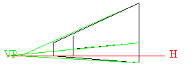
Horizon
line at low level |
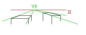
High
horizon-line |
 |
 |
| Option In
perspective theory, the horizontal parallel lines (such
as the bands marking the storeys of a building) seem to
converge on a single point, the ‘’vanishing
point’’ ; it marks the level of the ‘’horizon
line‘’ which is that of the observer’s
eyes. When the draughtsman selects a low horizon line
by comparison with the building, it suggests that the
observer is at the level of pedestrians in the street,
with eyes near the middle of the ground-floor.
Interpretation This option makes the viewers
share the viewpoint of passers-by, with the buildings
towering above them. |
Option The
draughtsman may otherwise select to draw the buildings
with their horizontals converging towards a high horizon
line, near their top. This supposes that the observer
is on a high standpoint.
Interpretation This option makes the observers
dominate the townscape, supposing they are themselves
standing on a high-rise and look down on its surroundings. |
|
| |
Historical significance:
In the past, low horizons were used to denote the superiority
of the sitter. In New York townscape photography, high-rise
buildings were, in the first decades of skyscraper architecture,
frequently seen at half-height, avoiding extremes of towering
or plunging effects. When they occur, they are thus striking.
In photography and film, plunging effects can be obtained
by ‘‘high angle views’’ whereas towering
objects are usually viewed with a ‘‘low-angle.’’
Examples |
| |
Horizon
line at low level |
High
horizon-line |
| http://www.nypl.org/ |
http://www.nypl.org/ |
| Berenice
Abbott’s photograph of ‘‘Department of
Docks and Police Station, May 5, 1936’’ gives
a view of a low-rise at street level. The horizon line
(indicating the height of the observer’s eyes) is
also at the level of the eyes of characters in the foreground;
so the viewers share the station point of the man-in-the-street. |
In the same
site, the section on Lewis Wickes Hines’s ‘‘the
Construction of the Empire State Building, 1930-31’’
shows ‘‘a worker at the edge of a platform,
looking North’’ from a high vantage point in
the scaffoldings, making us share the dangerous station
of the workmen. |
|
| |
| |
| HOW ARE THE DISTANCES ARTICULATED? |
| |
Foreground |
Background |
 |
 |
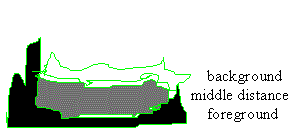
| Option Among
the ‘’three distances’’ which traditionally
structure the landscape so as to give it depth, the painter
may select to emphasize the foreground, using the middle
distance as a transition towards a distance which serves
as a mere ‘’background’’ to enhance
the foreground motifs.
Interpretation This is the case in heroic portraiture
or classical landscape, where ‘‘foreground’’
signifies ‘‘importance’’ and ‘‘background’’
supposes ‘‘insignificance.’’ |
Option The
painter may prefer to focus on the distance, using the
foreground and middle distance as foils to lead the eye
towards the central motifs placed behind them.
Interpretation This structure implies that the
setting as a whole is important. |
|
| |
Historical significance:
The celebrity of Manhattan’s ‘‘skyline’’
implies a reversal of European conventions giving pre-eminence
to the foreground (a hierarchy still existent in the language),
and an assertion that the city as a whole is the focus of
attention.
Examples |
| |
|
| |
| |
| HOW
DOES THE COMPOSITION RELATE PERPENDICULARS TO DIAGONALS? |
| |
Square
framing |
Diagonals |
 |
 |
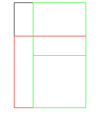
| Option In
a rectangular composition, the draughtsman may select
to place main compositional elements on the square built
within the rectangle on the smaller side of the rectangle
(in red). For the longer side of the rectangle, it is
its half that will form the side of the construction squares
(in green).
Interpretation The key elements can be found
by tracing this compositional grid which points to them. |
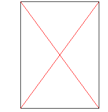
Option The
draughtsman may choose to place the main lines of the
construction on diagonals.
Interpretation Like the oblique view (to which
it can be associated), this composition emphasizes dynamism. |
|
| |
Historical significance:
Selecting these time-honoured methods stresses the rigorous
construction of modern townscapes. It is often a way of indicating,
in addition to objects, the articulation between the major
elements or distances, stressing the framing effects.
Examples |
| |
Square
framing |
Diagonals |
| http://www.whitney.org |
http://www.nypl.org |
| In the site
of the virtual exhibition ‘’The American Century’’
(accompanying the current exhibition at the Whitney Museum),
the timeline allows the user to select (for 1931) Earle
Horter’s The Chrysler Building Under Construction.
The square within the rectangle falls at the level
of the cornice of the foreground building, emphasizing
this separation between the foreground and the Chrysler.
The squares formed on the half-height create a vertical
on the dark band which underlines the Chrysler to the
left. In both cases, it is the framing element which is
highlighted. |
Lewis Wickes
Hines’s ‘’A worker hanging on to two steel
beams’’ shows the man against a gridiron pattern
of streets placed diagonally; this emphasizes the oblique
gesture of his arm and his unbalanced position. |
|
| |
| |
| |
|


